 |
| https://commons.m.wikimedia.org/wiki/File:Rory_sketch_-_confused.jpg |
Okay, I’m a numbers geek. I know this. You know this.
So I will now mention that I have a hobby of reading economics and politics news. Sometimes, I think of it like my version of watching football. Just with less action and more global significance.
And you are now warned: if you are not in the mood for a few numbers and charts, you might want to skip this post. 😉
With that said, I find that quite often people will throw a number out without really considering what it means and why they are mentioning it. Numbers, by themselves, do not have meaning. They represent a quantity. Until you give it a unit (or explain why it is appropriately unitless) and define what it is measuring, it is just a symbol on a page.
(This statement isn’t just for applied fields, it is true for abstract mathematics, too.)
So I am confused to see the following central point on the PBS’ “Making Sense” site in an article about the lack of wage growth in the US labor market:
One would then expect that with low unemployment — and 4.9 seems to fall into that category — wages would increase. But many economists point out that the 62.9 percent labor participation rate remains low by historical standards, suggesting slack in the market — plenty of discouraged workers sitting on the sidelines, waiting to jump back into the workforce once they have reason to believe employment prospects are good.
Whenever I read statements like this, I like to understand them. A quick look at unemployment numbers shows a historical average of about 5.8%, so 4.9% is indeed low. But what does the “62.9% labor participation rate remains low by historical standards” mean? Let’s take a look at it.
The US government makes this data really easy to access. (Does anyone know if Thailand has such an easy to use website for data geeks such as myself?) Go to the Bureau of Labor Statistics page on the labor participation rate:
http://data.bls.gov/timeseries/LNS11300000
Adjust the starting year to the earliest they have (1948) and observe the following historical graph:
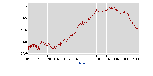
So the current labor participation level of 62.9% which is supposedly low by historical standards, is higher than any level between 1948 and 1978. Relative to the 40’s, the 50’s, the 60’s and the 70’s, this is a very high level. Only the 80’s and 90’s saw it growing higher and then it has been coming down from about 2000 onwards. But then if you look more recently, it hasn’t been higher than 62.9% since early 2014.
So how is this current number “historically low”? Why wouldn’t you look at this history and say that the 1980’s to 2000’s levels are unusually high? If you look over the long term history (the past 67 years), the current rate looks rather in the middle. If you look over the short term history (the past 2 years) it is actually high.
Do most economists see history in terms of only the past 30 years? Or do people (both economists and lay people such as myself) simply come up with a theory and cherry pick which parts of the historical record fit with the theory they “already know to be true”? (And just wave their hands at the historical record to make their point.)
This is a real question, not a rhetorical one. For a different example, after the 2008 spike in unemployment, I looked at the historical unemployment graph and saw that the rate at which unemployment drops after a spike is somewhat predictable. Look for yourself:
http://data.bls.gov/timeseries/LNS14000000

Interestingly, the strange shape of the early 1970’s spike, the mid 1970’s spike and the early 1980’s spike coincide with crazy high federal reserve interests rates (upwards of 19% in the early ’80s) followed by rapid drops. (I guess the theory is that higher interest rates cause people to keep money in the bank rather than buy things, causing the economy to tank. I don’t really know what happened in the 50’s and 60’s.)
So the unemployment rate began coming down in 2010 and I ran an extrapolation based solely on historical average decreases from the decreasing periods in 1950 to 2008. The result came out that the US unemployment rate would drop below 6% (roughly the historical average at the time) in 2014. Which is what happened. But when I read the various professional journalists and academics out there, all I saw were depressing arguments that unemployment was dropping unusually slowly because Obama wasn’t doing enough or was doing exactly the wrong thing to help. Yes, the only thing the left and the right agreed on was that the rate was falling too slowly… but they had polar opposite prescriptions for the problem. Except that the rate at which unemployment actually dropped was about the same or a little faster than rate at which it dropped under the presidencies of Reagan, Bush Sr, Clinton and Bush Jr., for the periods when it was actually dropping. (With the exception of the crazy rise and fall during the beginning of the ’80s when the interest rate went from about 4% to 18% to 10% to 20% back to 10% all in the course of about 4 years.)
I’m not saying I did anything particularly clever. Just the opposite. What I did was basically look at what usually happens and model it without any special knowledge or expertise at all. And yet no one anywhere on the economic or political spectrum that I could find had mentioned that what was happening with unemployment as it dropped was pretty much in line with what always happens. Why not?
So the central point of the PBS Making Sense article is that despite large numbers of jobs being added to the economy now, low unemployment rates, and large numbers of discouraged workers coming back into the workforce, the sole negative factor keeping wages from rising is the historically low value of the labor participation rate. Which isn’t particularly low historically.
Hmm.